 As we learned in a previous post, many businesses are neglecting mobile email marketing, an area that is experiencing such booming popularity that experts believe it can no longer be ignored. IHS reported smartphones will comprise one-half of the cell phone market in 2013, two years earlier than the firm had previously forecast. IHS projects smartphones will account for 54 percent of the total market in 2013, up from 46 percent in 2012 and 35 percent in 2011.
An IDC-Facebook study projects that U.S. smartphone use will reach 57 percent in 2013, up from about 49 percent in 2012. The study also found that more users (78 percent) check their email more often than they browse the web (73 percent) or check Facebook (70 percent) on their mobile phones.
However, while an increasingly large number of users are accessing email on mobile devices, an Econsultancy survey found that “the majority of companies do not have a well-defined mobile strategy,” with responses showing that 76 percent of companies have a mobile strategy that is either “basic” or “nonexistent.”
“Clearly, mobile is where marketers need to be,” said Jessica Meher of HubSpot, warning that email marketers need to “be mobile or fall behind.”
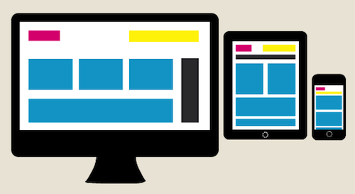
Responsive and Scalable Email Design: What They Are
To execute an effective mobile strategy, email marketers need to acquire the skills to format emails for mobile devices. As Yesmail explains, “There are two tactics brands can employ to evolve their email campaigns to be in line with consumers’ growing affinity for mobile devices: scalable design and responsive design.”
Responsive Email Design is based on the relatively recent CSS3 coding technique called media queries (also called @media query). It enables you to design a version of your email that will automatically recognize that a mobile device is being used and resize and reformat the content for the device’s screen. With media queries, you set a screen-size threshold, and when the code in your email detects that the screen size is below that threshold (typically 480 pixels), it activates the code you have created and formats the email for that device.
As Yesmail explains, responsive email design can be summed up as an “if, then” statement. If a screen is 480 pixels wide or less, the CSS media query code loads a specified email style on that device.
As Linda Bustos of Get Elastic explains, responsive email design enables a designer to modify, hide, stack, add or expand/collapse content to optimize usability for narrow screens. For example, three columns can become one column, and images can be resized. Responsive email design allows you to format the presentation for specific mobile devices and make the best utilization of the screen space on that device.
Scalable Email Design is a method that enables you to design messages that will reduce in size when read on a mobile device. Scalable design is based on HTML code that uses 100 percent table widths that adjust in size to span 100 percent of whatever mobile device’s screen is used. Scalable design simply shrinks a regular desktop-size email design to fit a small screen size. Unlike responsive design, it does not involve coding to hide or display specific features.
As Yesmail explains, scalable design provides:
- One layout compatible on both regular-sized computer monitors and small mobile screens
- A grid system to ensure all objects within the layout are aligned properly and proportional to one another
- A single-column stacked layout (usually) to streamline text
The number-one tactic to keep in mind when creating scalable emails for the small screen, says Yesmail, is to think big-big fonts, buttons and white space.
Responsive vs. Scalable Email Design: Pros and Cons
Both responsive and scalable design have their pros and cons, which Lauren Smith of Litmus illustrates via a handy chart. In general, scalable design works everywhere, is a single design and is easy to code, but is not a “true” mobile design. Responsive design, on the other hand, is a true mobile design model, but is more complex, requires multiple designs and doesn’t work on every phone.
Responsive Email Design works on iPhones and particular Android phone models, while Gmail and Outlook do not display the media query code. SendPulse’s “Email on Mobile Devices” offers guidance for formatting emails using Responsive Email Design and includes special formatting tips for Android devices and Gmail.
You should use analytics to determine which devices your audience is using to read your emails, then formulate your mobile design strategy accordingly. Also use analytics to monitor the effectiveness of your email content and make appropriate adjustments.
In addition to Yesmail’s “Mobile Email Design,” other helpful resources include Linda Bustos’s “24 Tips for Responsive Email Design” and Campaign Monitor’s “Responsive Email Design” guide. A great roundup of responsive design tutorials also is available on Creative Overflow.
Email Marketers’ Opportunity to Shine
Whichever method you choose to format your email for mobile devices, it is imperative you begin to tailor your content to provide a satisfying mobile user experience.
As Yesmail relates, survey data show many users are dissatisfied with the formatting of the emails they view on their mobile devices. “If consumers are frustrated by emails that are not mobile-friendly,” the data showed, “63 percent of them will close and forget about or simply delete the messages.”
Likewise, Linda Bustos notes, as mobile email open rates top 50 percent, it is too costly to disappoint your email subscribers with an unusable experience.
Want more information on mobile email marketing? Subscribe to the TowerData blog!
Photo Credit: Kuno Creative
 Affiliate Marketing
 Automotive
 eCommerce and Retail
 FinTech
 LeadGen
 Nonprofit and Political
 Payments
 Technology Platforms
 Tourism and Hospitality

